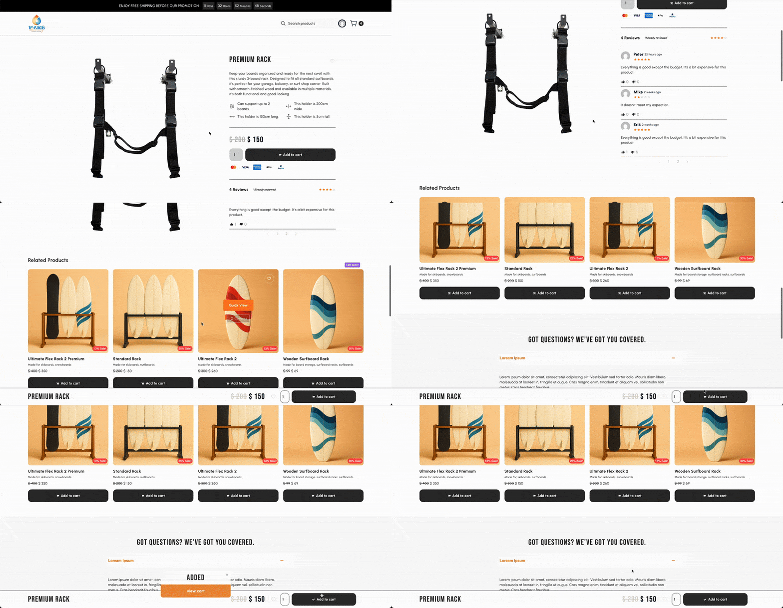
On long product pages, the moment of intent gets interrupted after reading details and reviews, shoppers must scroll back to the top to find the add-to-cart, breaking focus and momentum.

On ecommerce sites, I want checkout to be effortless. Too often, I read specs and reviews, then have to scroll all the way back to the top just to purchase—it’s annoying. I don’t want our shoppers to feel that friction. That’s why we added a sticky add-to-cart bar with the price, always within thumb’s reach.
Htein Lin, Web Developer
The Idea
We introduced a sticky add-to-cart bar that pins to the bottom of the viewport. It shows the product price and a clear call to action, remaining present as shoppers read descriptions, specs, and reviews. The bar is compact, responsive, and designed to avoid overlap with other UI, so it helps without shouting.
Our Goal:
- Keep purchase controls visible while scrolling
- Reduce steps between interest and add-to-cart
- Maintain a clean, unobtrusive UI on mobile and desktop
Our Result
Shoppers can add items the moment they decide—no re-tracing steps—so the path to purchase stays smooth and intuitive. The control feels practical, reduces friction on long pages, and supports faster, more confident decisions. See it live: Wake Alchemy
