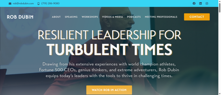
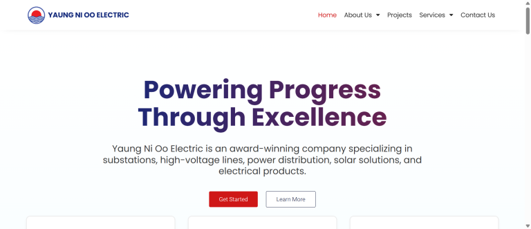
Brands fall apart when every designer, marketer, or vendor “guesses” the look. Brand Identity & Guidelines turn taste into a system: a clear visual language, approved assets, and rules that are easy to follow. You get consistency across web, print, ads, and social—so customers recognize you instantly and trust you faster.
We map the building blocks—logo family, color, type, layout, imagery, and tone—and show exactly how they work together. Accessibility (readability and contrast) is built in, not bolted on, following the W3C’s practical guidance for color and text contrast so real people can read your content comfortably (W3C WAI contrast). Fonts are chosen for licensing clarity and performance; we document usage based on resources like Google’s font licensing notes (Google Fonts Knowledge). The result is a brand style guide that’s easy to apply and hard to misuse.
What’s included (deliverables)
- Logo system (primary, alternates, one-color, spacing & misuse)
- Color palette with contrast-checked pairs and usage notes
- Typography stack (headings, body, UI) with web/print specs
- Layout grid, spacing, and component patterns (cards, CTAs, forms)
- Imagery direction (photo style, illustration, iconography)
- Voice and tone guidelines with do/don’t examples
- Real-world templates (pitch deck, social, letterhead, email)
- File kit (SVG/EPS/PDF/PNG), export presets, and brand portal (optional)
- Accessibility checklist and QA cheatsheet
- Governance model (who approves, how to request exceptions)
How it works (process)
- Discovery & audit → goals, audience, competitors, what to keep/change
- Identity directions → two visual territories with rationale and use-cases
- System build → logo family, color/type, components, accessibility checks
- Guidelines → write rules, do/don’t, and examples in a clear format
- Templates & assets → export production-ready files and kits
- Review & refine → stakeholder feedback, polish, and approvals
- Handover → training session, brand portal, and rollout plan
Benefits (what you’ll feel)
- Recognizable presence across every channel—less rework, more trust
- Faster production with ready templates and clear do/don’t rules
- Fewer inconsistencies from agencies and vendors
- Accessibility built in, reducing legal and UX risk
- A system that scales as you add products, pages, and campaigns
Comparison
| Area | DIY / Theme | Freelancer | Bold Label |
|---|---|---|---|
| Consistency | One-off look | Varies | Full identity system with rules |
| Accessibility | Often ignored | Mixed | WCAG-aware contrast & sizes |
| Assets | Random files | Limited | Organized, versioned, ready to use |
| Governance | None | Ad-hoc | Clear approval flow & enforcement |
H2: Brand Identity & Guidelines that scale with you
A great identity isn’t just a logo; it’s a kit that anyone can use without breaking it. We define tokens (colors, type sizes, spacing) and patterns (cards, buttons, sections) that translate perfectly to web components. Typography choices are tested for performance and readability, and we document pairing rules and fallbacks. Where illustration or icon styles are needed, we specify line weight, corner radius, and motion hints so future assets match. Every choice ties back to clarity, speed, and accessibility, validated against WCAG guidance and practical typography resources (W3C WAI, Google Fonts Knowledge).
Key terms to know
Lockup: Predefined logo arrangements (horizontal, stacked, icon-only) that keep spacing consistent.
Clear space: Minimum breathing room around the mark so it stays legible.
Token: A named design value (e.g., --brand-primary) used across web and print for consistency.
Contrast ratio: The difference between text and background; WCAG defines readable targets.
Type scale: A set of font sizes/line-heights for predictable hierarchy.
Grid & spacing: Layout rules that keep pages tidy and scannable.
FAQs
- Can you work with our existing logo?
Simple: Yes—keep what works, improve what doesn’t.
Technical: We refine curves/spacing, expand lockups, and document usage while maintaining brand equity. - Will the guide be easy for non-designers?
Simple: Very—examples first, rules second.
Technical: We deliver visual do/don’t, templates, and a lightweight governance model (approver, request flow). - How do you handle web performance and fonts?
Simple: We pick reliable families and document usage.
Technical: Font subsets,font-displaystrategies, and licensed families; we include fallbacks and usage specs. - Is accessibility included?
Simple: Yes—baked in.
Technical: Contrast-tested palettes, minimum sizes/weights, and link/interactive states aligned to WCAG guidance. - What file formats do we receive?
Simple: Everything you need for web and print.
Technical: SVG/EPS/PDF masters, PNG exports, and editable templates; plus an organized file tree and version notes.
Call to action
Ready to stop guessing and start scaling? Let’s build Brand Identity & Guidelines you can hand to anyone—clear rules, flexible assets, and a system that protects your brand while keeping production fast. Book a quick call and we’ll map your identity, templates, and rollout plan.

